SELECTED WORK SAMPLES
Museum of Food and Drink
Logos & Identities
Micromuseums
ComplexCon
Complex Networks
Lettering & Modularity
Prepared for SUNY NY
BRANDING • VISUAL IDENTITY • EXHIBITION DESIGN • ENVIRONMENTAL DESIGN • FURNITURE DESIGN • MOTION DESIGN
THE MUSEUM OF FOOD AND DRINK
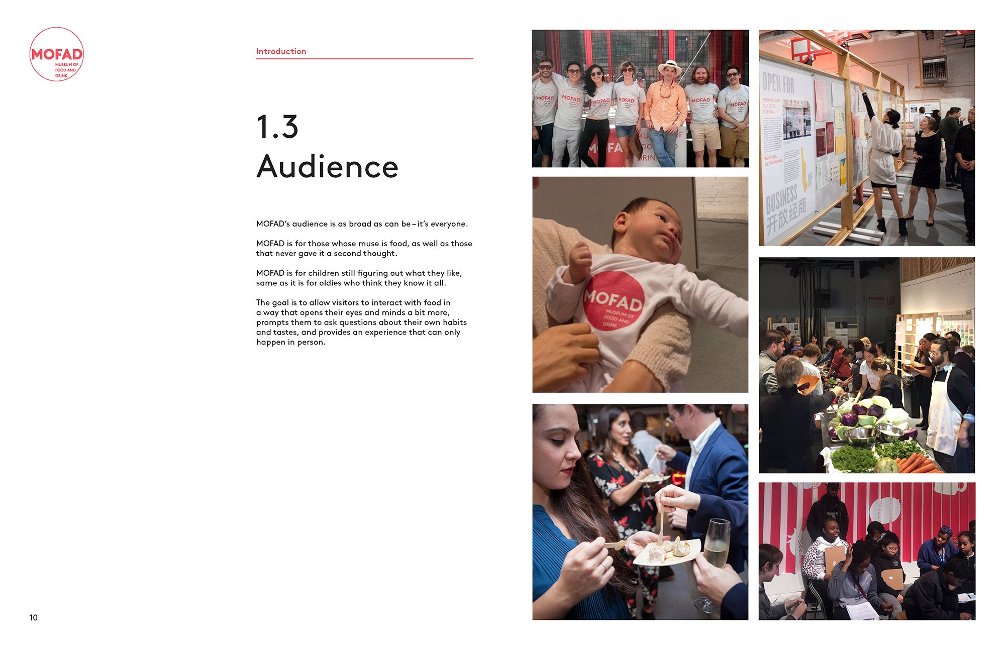
The Museum of Food and Drink (MOFAD) was in its extreme infancy when I and my partner at Labour were approached to help bring it to life through branding and exhibition design. The museum had a complex goal: appealing to a wide audience who may not have any interest in food issues, while also being able to stand alongside the MoMAs of the world from a visual standpoint.
IDENTITY
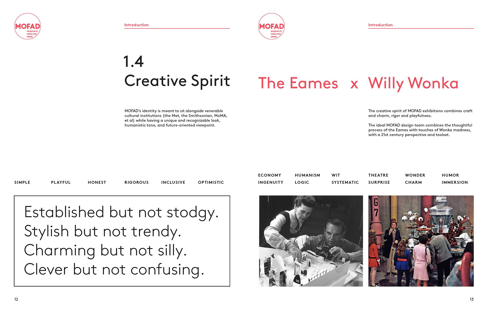
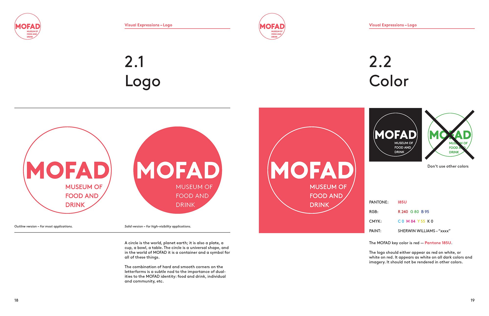
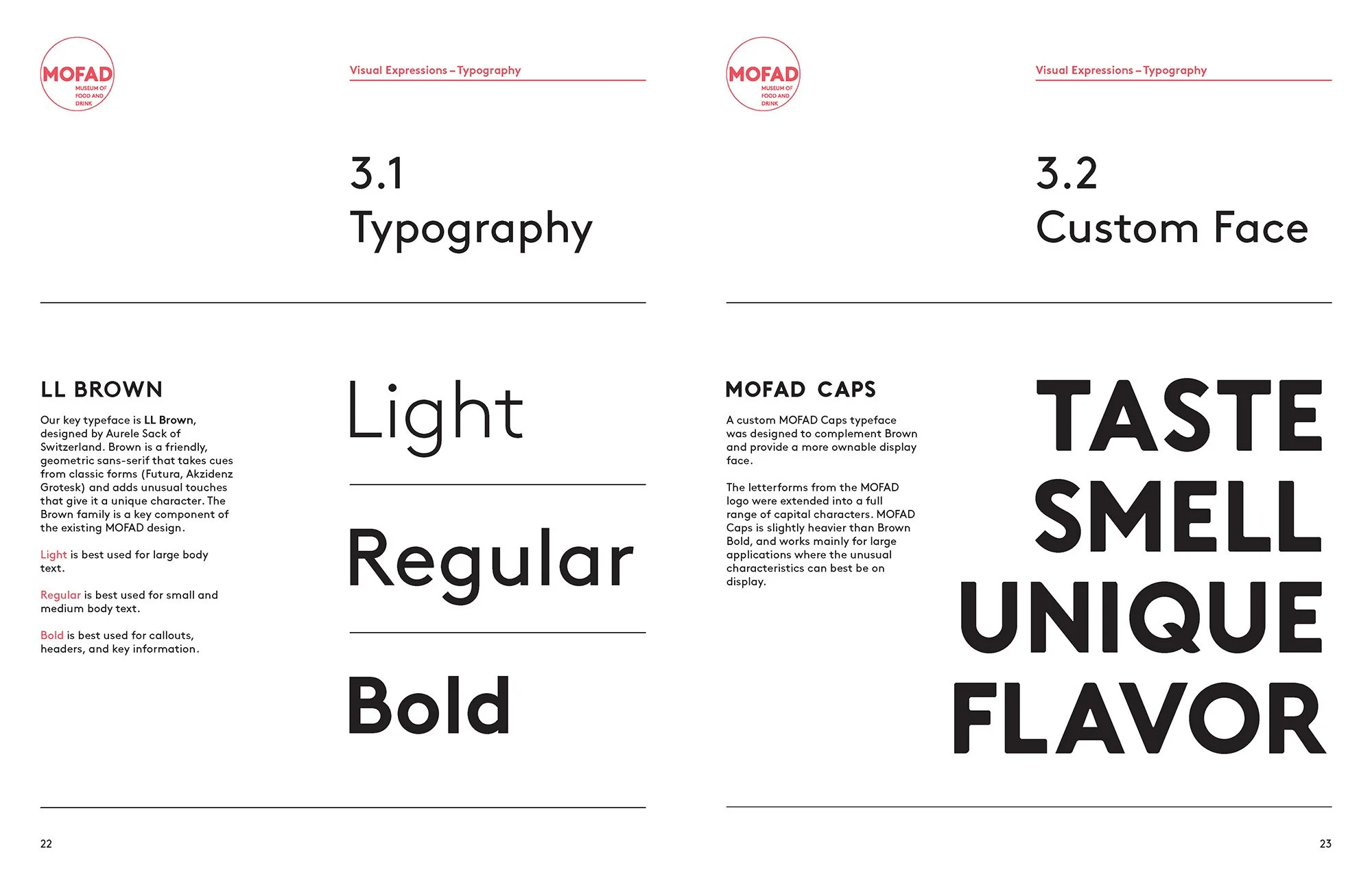
The sharing of food is the bedrock of culture globally, and the circle is the bedrock of MOFAD. It is the cup, the plate, the saucepan, the saucer, the globe. Our circle is a container when needed, as well as a stamp and a solid. The MOFAD wordmark mixes hard edges with rounded edges, creating a friendly look that rewards closer examination.
The brand guidelines dive deeper into the tonality of the museum, which is “Willy Wonky meets the Eames.”


EXHIBITION DESIGN
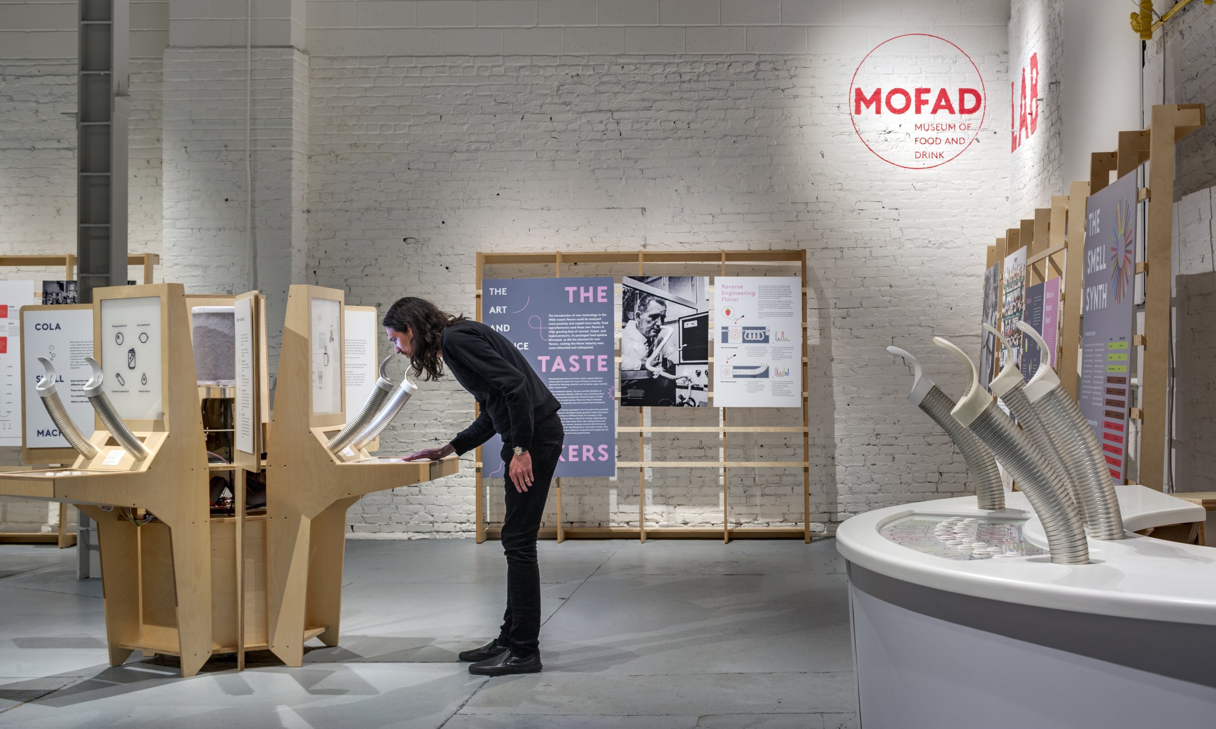
The first semi-permanent exhibit was called Flavor: Making It and Faking It, and was all about the flavor industry and how humans perceive taste and aroma. At Flavor, visitors could play smell synthesizers shaped like giant arcade cabinets and sample flavor pellets from gumball dispensers dotting the exhibit. Our studio designed custom modular display racks for graphics to hang from, and custom cabinets and furniture for the smell synthesizers and welcome desk.
VIDEO & MOTION GRAPHICS
Visitors were greeted by a gigantic monitor playing an introductory video on loop, illustrating how our tongues, nose, and brains work together to create the sensation of flavor, narrated by Ted Allen (host of Chopped.) I scripted, directed, edited, scored, illustrated and animated the video, with shooting assistance from Colony Projects.
MARKETING
I also created a :30 teaser video after the opening of the exhibition that could be easily shared and spread. I scripted, shot, animated, and composed the music.
Additionally, we had the honor of being joined by Paolo Antonelli, the senior curator of design at MoMA for a talk about the future of museums, held in our space.
BRAND EXTENSIONS
In addition to its exhibitions, MOFAD has a variety of public programs, ranging from talks and demonstrations to a culinary touring app.
We completed a second exhibition, entitled Chow: Making The Chinese-American Restaurant, after Flavor.
After several years away, I’ve recently completed a family-friendly revamp of Flavor that is living in Dumbo at 55 Water St.

LOGOS & IDENTITIES
A brand is far more than its logo, but the logo must encapsulate the spirit of the brand and contain the seeds of the overall identity. Here I’ve collected a variety of logos for brands and organizations that all have built-out identities, too much to go into in this space.

BRANDING • VISUAL IDENTITY • 3D DESIGN • INFOGRAPHICS • BOOKLET DESIGN • VIDEO
MICROMUSEUMS
The founders of Micromuseums (Micro) approached Labour after visiting the Flavor exhibition at MOFAD. They had a remarkable idea that had no form – they wanted to make The Smallest Mollusk Museum. Not a museum about the smallest mollusk, but the smallest museum, about mollusks, about the size of a person. But that was just the beginning.
We collaborated with Micro to make the first ever distributed museum – a fleet of six-foot tall, reproducible, cultural vessels that you might find in a waiting room, the DMV, lobby, or anywhere where there is underutilized space and people with time to kill. The mission of Micro — makers of Micromuseums — is make museums and learning accessible and free to all.
IDENTITY DEVELOPMENT
The Micromuseums logo features a customized Futura, stacked in a way that echoes how the content of the museum is arrayed. The box is a clear linkage to the form of the museum itself, and the logo for Micro—the parent organization—adapts those forms into its simplest expression.
DIMENSIONAL DESIGN & GRAPHICS
The form of the museum was developed at the same time as the brand identity and graphics system. Physically, the museum is comprised of a dozen or so ‘exhibits’ that fit into box shapes of various sizes, arrayed around a central support spine that also houses electronics. ‘Surprise and delight’ moments pepper the negative spaces around the main content, and a holographic video lives in a pyramid in the base, just perfect for curious kids.
The graphic design of the museum exhibits follows a pared-down approach that packs a lot of content into small pockets of space. Not every surface is covered, as white space is essential for a positive reading experience.
BOOK
Visitors are invited to dig deeper into the content of the museum, either through an audio tour on the website, or in printed books that accompany the exhibition. I designed the books to incorporate the style of the physical museum, but with a classic approach to body text.
BRAND EXTENSION
We completed a second Micromuseum, titled the Perpetual Motion Museum. This museum used the dream of perpetual motion as a way of examining how energy works, the incredible ways the sun powers everything on earth, and the eventual heat death of the universe.

CREATIVE DIRECTION • MESSAGING & THEME • VISUAL IDENTITY • MOTION DESIGN • ENVIRONMENTAL DESIGN
COMPLEXCON
I was Creative Director (2017-2019) and Executive Creative Director (2019–2023) of Complex Networks, and during this time I was also creative lead for ComplexCon, a huge annual festival of creativity and commerce known as “the cultural super bowl.” For these events, which drew visitors from across the world and USA, I worked side by side with renowned international artists, most notably Takashi Murakami, who served as the original artistic director.
Selected slides from a concept deck shared with Murakami illustrating the theme.
Key graphic, animated logo, and cycle mandala
Thematic trailer.
Social and out-of-home marketing examples.
Over 15,000 visitors came through over the course of two days. Countless connections were made, including our introduction of Virgil Abloom to Murakami, which lead to a fruitful collaboration and numerous art exhibitions.
IDEATION & DEVELOPMENT
I spearheaded the theme and messaging of the event each year, with buy-in from our Editor-in-Chief along with Murakami. As an example, our 2018 event responded to the insanity of the emerging Trump era with the theme of “Growth From Chaos.” To illustrate the theme, I worked with Murakami on an artwork approach that depicted the circularity of life and culture, with representations of Chaos, Growth, and Enlightenment. An all-over background combined skulls with flowers to portray the connectivity between death and life, and the necessary end of all things, good or bad. And most significantly, the ComplexCon logo was augmented with Murakami’s spraypaint version of the enso, an ancient buddhist graphic form that represents the beauty in imperfection, the circle of life, and connection.
MARKETING
The Growth From Chaos concept was communicated to our brand partners, vendors, and audience through our trailer video. I concepted, directed, and animated this trailer with editing by Elan Alexenberg. The graphic motifs and layering system also led our social platform strategy, introducing our vendors, speakers, performers, and more. Billboards and wild postings brought local attention to the gathering as well. I personally designed and executed all of the marketing elements.
PHYSICAL APPLICATIONS
Visitors were met by a giant inflatable version of the Enlightenment figure, alongside a huge banner with Chaos and Growth graphics. As a big photo moment and welcome to visitors, a giant 60’ digital screen brought the Chaos/Growth/Enlightenment motif to life with 3D animation contributions from Esteban Diacono.
These graphics served as the basis for show elements like credentials and wristbands, as well as a wide array of limited edition merchandise available only that weekend at the event – over a million dollars of ComplexCon x Murakami product sold in two days.

CREATIVE DIRECTION • MESSAGING • VISUAL IDENTITY • MOTION DESIGN
COMPLEX NETWORKS
Complex is a youth media brand that has pioneered a genre-agnostic perspective toward creativity, commerce, and community since 2002. Fashion designer and founder Marc Ecko started Complex as a a magazine that championed multifaceted emerging talent like Pharrell Williams, Beyoncé, Rihanna, Kaws, and others and helped hip-hop culture achieve mainstream acceptance.
Labour closed its doors and joined Complex in 2017 at the request of Marc Ecko, after having been a retained studio for several years. Complex was shutting down its magazine, refocusing on social, website, original video content, ComplexCon, and licensed content, and Ecko was stepping down to pursue other opportunities. Myself and my partner were brought in to retrain a legacy design team and unify fragmented creative departments across the company and four brands.
MOTION DESIGN & IDENTITY
I created dozens of identities for shows, initiatives, and sub-brands at Complex, all demonstrating the tenets of the brand book. Each show had a motion identity, logo, and extensive visual expressions including social elements and marketing.
Here is a collection of some of the programs and initiatives I designed or re-designed, from the core logo for all of Complex Networks to our podcast network and e-commerce platform, and a dozen or so video programs along the way.
As I moved into the Executive Creative Director role, I was less hands-on with the creation of new identities and focused on coaching my creative directors and art directors to successfully carry out the vision themselves.
COMPLEX COVERS
There are far too many things to display here – hardcover books, products, pop-up events, and more. But throughout everything, we continued to create digital versions of our magazine covers.
Pages from the Brand Book focusing on mission and philosophy… and typography. I created the text for the book alongside the content team, and produced the total layout.
Collected identities for Complex, in motion. All motion and design work is my own.
Blueprint is a YouTube show that ran for four seasons. Notable cultural figures break down their history and the lessons they learned as they built their artistic or media empires.
Complex Cover is a premium digital interview, an evolution of the print magazine cover feature. To demonstrate this evolution, the logo begins as the old vertical masthead, then turns 90° to become a screen.
Complex on Fuse brought the world of Complex Network to linear tv. The concept was “Complex in a blender” – mixing and mashing together a variety of shows with a totally different lineup each week. The graphic voice added a dash of absurdity and lo-fi spontaneity to make it feel like it was being made in real time.
Everyday Struggle was a long-running daily hip-hop talk show that racked up tens of millions of views. Boxing was a loose thematic guide, setting up the tension and conflict between the hosts, symbolized by the fraying rope.

ART • TYPE DESIGN • PRODUCT
LETTERING & MODULARITY
My personal typographic explorations are informed by a few lifelong interests – the physiology of the eye and brain, and how we fill in the blanks to create meaning; the philosophy of aesthetics and what is essential for a letter to be a letter; and rule-based system design in the vein of Sol LeWitt, George Keyes, and others.
These explorations have typically taken the form of large paintings or graphics for apparel, exploring the relationship between the evocative meaning of a phrase and its rendering. Themes of obscurity, complexity, and emergence are threads connecting these explorations.
These images are typified by the presence of a grid system that is revealed or implied by the forms – sometimes curvilinear, often isometric and angled, creating an innate dynamism that is drawn out on top.
I developed a variety of geometric, unit-based typefaces that fit cleanly into these grids so that they line up tightly with the other elements, and these typefaces became the basis for several wordmarks and custom type styles for clients and ourselves.
This modularity also extended to some of our client projects. One dream assignment was creating a ‘digital toy’ to honor the relationship between the Eames studio (a huge influence on the Labour studio model) and Herman Miller. I created a language of modular units that mixed visual devices pulled from various Eames projects, and brought them to life through motion. In the toy, visitors could move, rescale, and toggle through items to create a sort of sculptural space. After 10 or 20 seconds, small animated visitors would enter the space and engage with the stacked graphics.
Another modular approach to type was Visage, a deconstructed typeface I created after a conversation with my brother, a professor of philosophy (pictured here) where he was asking what essential elements were needed for a letter A to be a letter A – and at what point does it cease to be a letter A?
Cognitive science has shown us that we read letter shape before we read individual letter, so I wanted to create a typeface where individual letters couldn’t necessarily be read on their own in isolation, but which snapped into focus through context. This typeface was applied to a series of shirts and cashmere pieces through Gingham by 2K.
Modular grids have been my playground for two decades, and I love that this approach makes the viewer slow down and pay attention – there’s something there to get, but what is it?


Thank you for your time. For further viewing, please visit the rest of the portfolio.