TYPOGRAPHY
& LETTERING
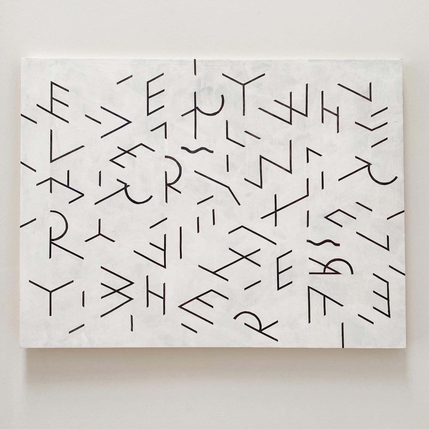
I’ve always been exploring letterforms through legibility and materiality, whether in personal projects or on client work. I try to create work that asks the viewer to slow down and work out what they’re looking at, and just enjoy the forms.
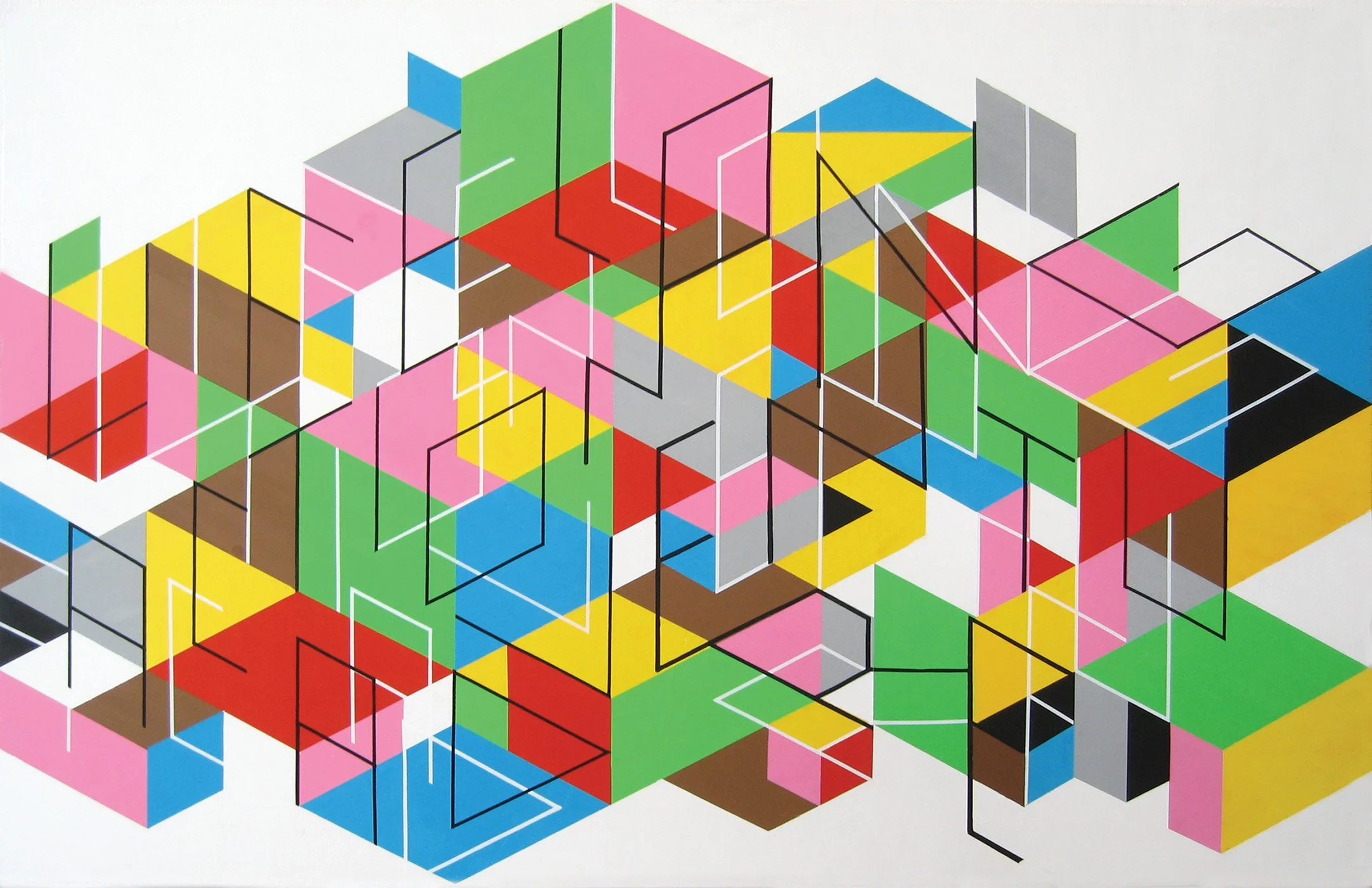
Here are painted works and studies for paintings. One became a blanket for Please Goods.
My brother is a philosopher, and I’ve always enjoyed talking with him about problems of language and aesthetics. He once asked – “What makes a letter A? What are the necessary conditions for it to be recognized?” I liked this challenge. Cognitive science tells us that we recognize word shape before we read individual letters, and that contextual clues are important to understanding meaning. So I drew an A that would be unrecognizable on its own, but meaningful in context.
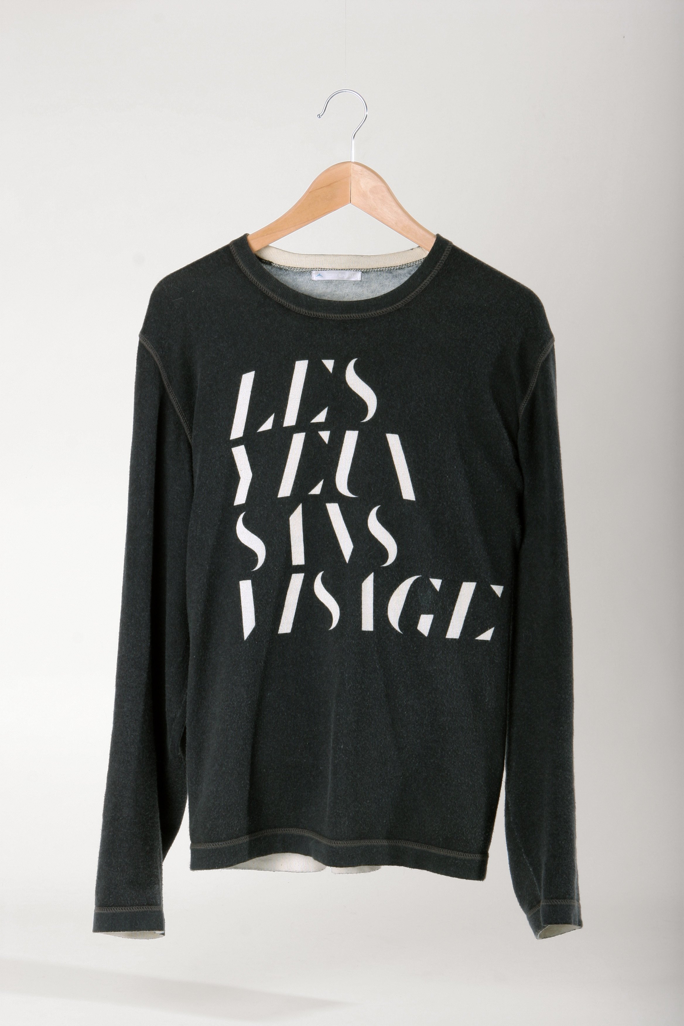
I drew Visage in 2005, a stylized blow-out of the high contrast of Didot. I produced a short run of t-shirts with 2K by Gingham in the following year, including some cashmere sweaters. We also used a cut-out version for the Yale University Art Gallery calendar in 2009.
I’ve also always explored type and imagery that blends the flat and the dimensional, the digital and analog. The first real Labour project was an identity for the AIGA’s MOVE conference in New York. I drew a rigid geometric typeface that fit a grid without any stroke contrast, and then we cut it out of wood. We collaged layered photographs into an isometric grid to really play with the sense of surface. We were also just excited to get away with using a totally untested typeface with questionable kerning for an AIGA conference.
One other project done with physical type was for Travel & Leisure magazine’s Global Vision Awards. All the elements of the illustrations were laser-cut and painted or stained and carefully assembled to be photographed. This could be done in 3D in no time at all, but the limitations of the process are what lead to the intrigue of the forms.
Lastly, here are type-based expressions for the mid-to-late 2000s for a variety of clients. It was a twee time.


